--> Seeing is Feeling <--
Visual communication is the type of medium that I tend to respond to most. To me, It encompasses more of the true meaning of the idea, product, or message that is trying to be made prevalent. I am deeply effected mentally and emotionally by means of visuals, which is why visual communication is what I respond to most, above all other means of communication.
In my opinion all aspects of visuals matter. When every visual tool works cohesively, it helps to create and portray the meaning and "mood" of the visual clearly, rather than one tool over the other. For me, simplicity, clean lines and the feeling of "light"is what I define as an effective visual. Types of visuals I find less effective is when there is an excellent type but the image or color scheme doesn't seem to make sense with the font type used or the written message, if there are too many different font types it creates a cluttered mess, or if there isn't a powerful enough photo to justify or back up the words used for a visual; in that case the designer is better off using no images.
I enjoy the simplicity of visuals, or a powerful or uplifting message behind the design. Even if it is food labels; I am a label Nazi; if it has a beautiful label, if it looks "earthy" or clean lined, or has an attractive font; almost like a work of art in a gallery; and it makes me feel good, I am most likely going to buy that product.
Three brands and people that I find most effective, and am most effected by are:
-Poler Outdoor Stuff (instagram: @polerstuff)
I respond to their visuals because the have the elements of strong visuals that I find most attractive. They display organic, clean simplistic lines, and their products are earthy and simple. There is not a whole lot of extra "stuff" that clutters their logo, product, and website.
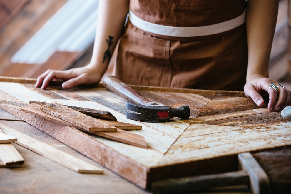
-Aleksandra Zee (aleksandrazee.com)
Zee's website is filled with photos displaying her work. The images that she uses to advertise herself and her work have an artistic feel. They are not just images of someone holding a piece of work, rather they show her working, her hands and the process of her creating a piece of art. These images are effective to me because of the type of art she creates and they make me feel good about purchasing her product.

-Free People (freepeople.com)
Although corporate (which I am typically anti), the overall feel of the images, design, and font type usage of their published magazine, website, and retail store portrays a "free" (no pun), "earthy" and happy feel. This heavily influences me and those alike who enjoy that type of ambiance when looking for clothing products. The photography images used in advertisements; no words needed; continually entice their shoppers to buy their product based off of their style clothing and visual messages within their magazine, advertisements, and on their website.